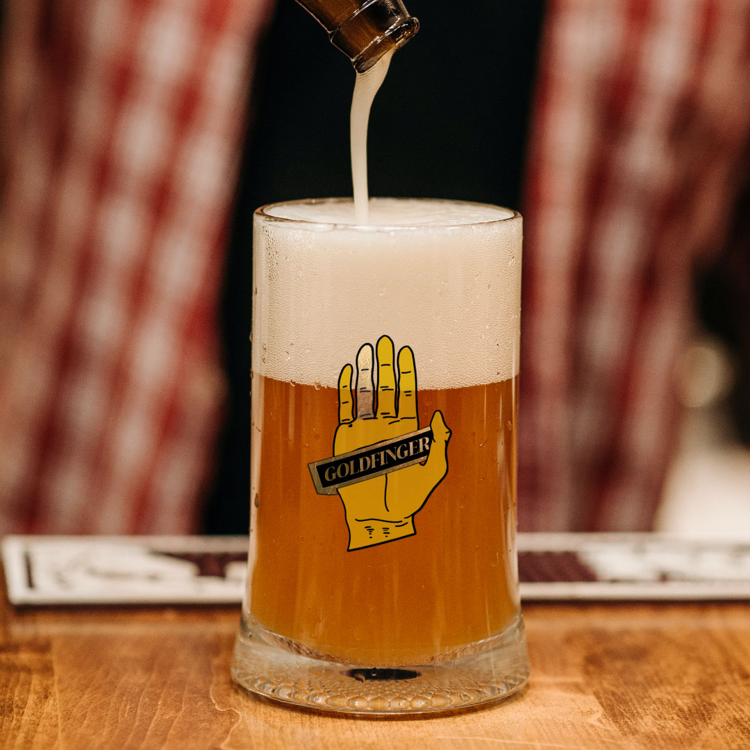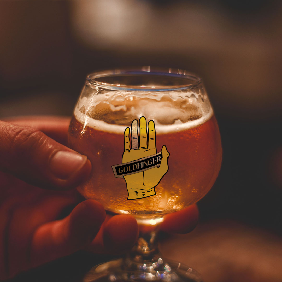
Goldfinger
A refreshing drink, Goldfinger’s unique flavour qualities expand at every sip.
Scope of work
____________
Brand Identity Design
Beer Label Design
Maxim & Dries spent the latter of 2020 brewing up a storm. It didn’t take long for them to realise they had something unique they could capitalise on.
Goldfinger is a bottom fermented beer, brewed by two boys in Belgium.
Their mission
____________
To bring a unique taste to Belguim at a time where change was required (the year 2020), and people needed something for comfort.
our approach
____________
We worked in developing a brand outside of the scope of the ordinary.
The Goldfinger logotype, accentuated by gold-foiling compliments the premium product. Inspired by the James Bond film, Goldfinger; the brand exudes the mysterious and powerful attraction, a-like to the film.
The result speak for themselves on this one. They sold out 10 days from launch.


